The M-DOT-T6 module combines the functionality of engraved touch fields and a touch screen. This guide is a device functionalities configuration guide, with particular reference to the application running on the touchscreen.
The following is required to use M-DOT-T6:
To ensure the availability of all functionalities of the M-DOT-T6 module, it is recommended to always use the most up-to-date version of the system.
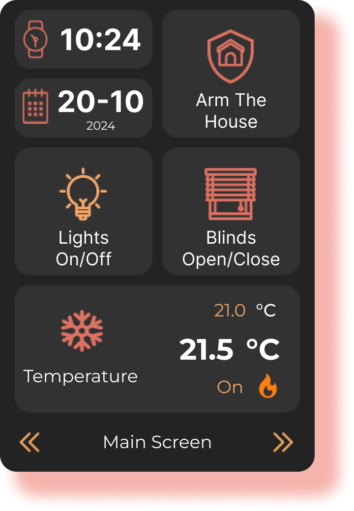
The application running on the M-DOT-T6 resembles a scrolling, interactive menu through which the user can control Ampio system devices.
The interface is divided into screens - which are sets of widgets that control the target devices.
 Click to enlarge and open in a new tab.
To start configuring the M-DOT-T6 application, in the Ampio Designer under the main tab DEVICES, navigate to the M-DOT module settings (cog icon) and then open the Display Creator on the left side of the screen.
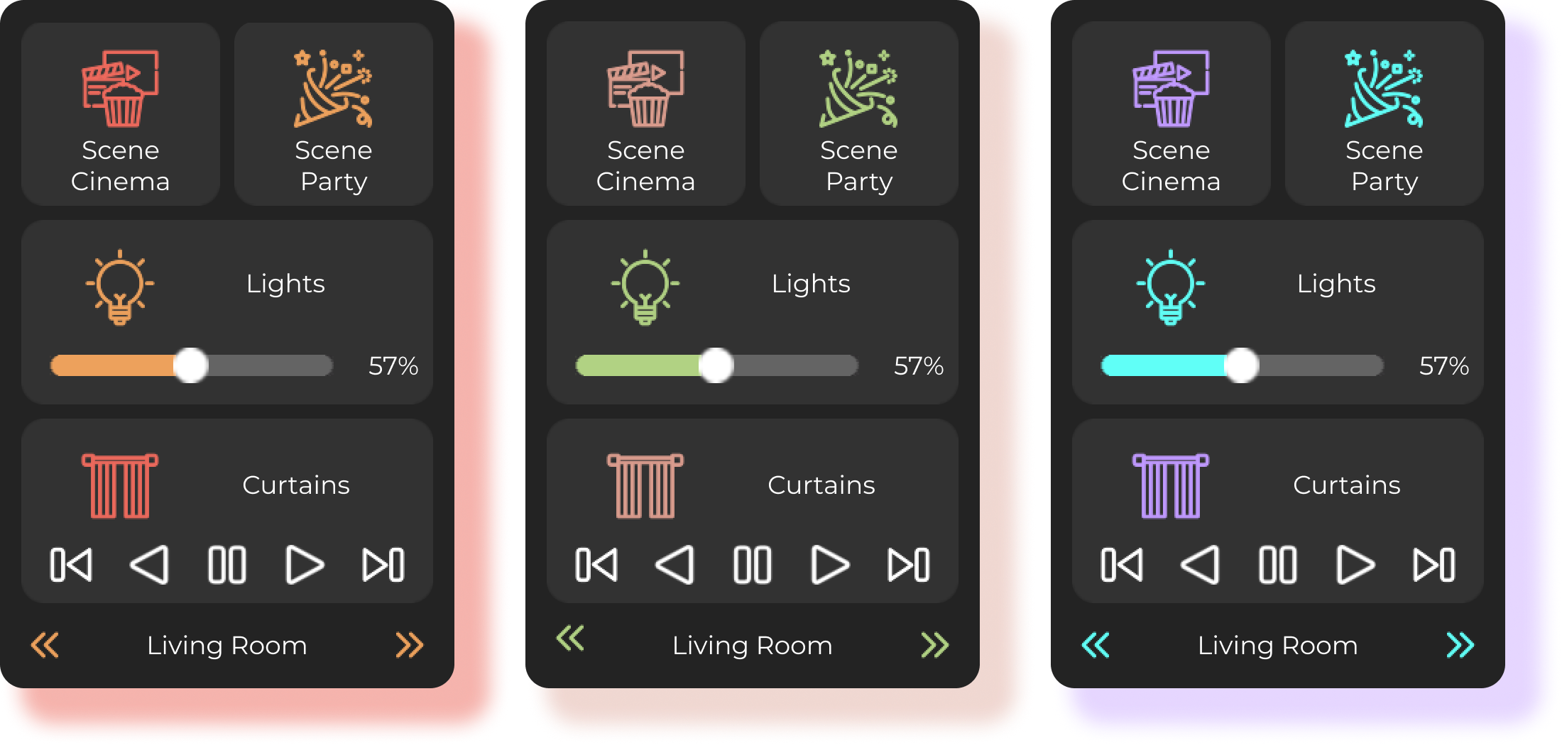
The M-DOT-T6 app allows the interface to be tailored to individual user preferences and interior design.
Configuration available:
There is a choice of two application themes light and dark. These change the background and adjust the colour of the fonts.

The colours are used to visually represent the status of a particular device - active or inactive. Users can select any colour from the colour palette or specify specific RGB values.
The corresponding colour scheme facilitates intuitive recognition of the current status of the devices.
 Click to enlarge and open in a new tab.
After entering the Display-creator, the first step is to select a theme and set the colour scheme of the statuses.
It is possible to:
If you try to save changes to the colour scheme, you will be prompted to update the icons on your device.
After each colour change, it is required to update the icons on the device. The process of saving icons can take up to 15 minutes.
Each of the screens in M-DOT-T6 is based on a grid, which allows the widgets to be positioned as desired. The interface supports two types of navigation:

Each M-DOT-T6 is capable of accommodating 6 screens, with a grid size of 20x4 (thanks to top-down scrolling). Given that the standard, simplest widget is 2x2 in size, up to 20 such widgets can be accommodated on a single screen.
In the most demanding configuration, one M-DOT-T6 screen is capable of accommodating up to 120 widgets.
The configuration of the screens takes place in the right-hand section of the Display Creator tab, where you will find a preview of the screens of the device. Here, you can manage the layout and content of the screens.
The available configuration functions are as follows:
All the screen configuration options discussed above are shown below.
Widgets are interactive interface elements used to operate target devices. They differ in their functionality and range of control options.
Widgets are divided into:
Each widget has a set of configurable attributes that can be tailored to specific functions and user preferences.
Switches the device between the on/off states. The colour of the icon represents the current state (active or inactive).

Attributes:
Widget that allows the control of a value within a specified range. Works well for devices with adjustable intensity (e.g. lights). The colour of the icon represents the status (active or inactive).

Attributes:
Widget for setting the temperature with an accuracy of 0.5°C/°F.
The widget shows:

Attributes:
Widget for controlling the position of curtains.

Attributes:
Widget for the presentation of values. Used to show states, measurements, levels. Does not allow for control.

Attributes:
Widget for displaying the time.

Attributes:
Widget for displaying dates.

Attributes:
Allows you to measure time. The elapsed time is shown on both the extended screen and the main screen.

Attributes:
Controls RGB and RGBW lighting on all channels. The bar above the sliders shows the current lighting status - reflecting both the colour and intensity of the set lighting.

Attributes:
Controls the CCT (correlated colour temperature) lighting. The lamp above the sliders mimics the current lighting condition - reflecting both colour and intensity.

Attributes:
Widget for controlling the position of the roller shutter. Allows you to set the exact position of the roller shutter and the slats. The window visualisation shows the current status of the roller shutter. If there are no slats, only one slider is visible on the screen.

Attributes:
Widget for controlling the position of the curtain. Allows you to set the exact position of the curtain and the slats. The window visualisation shows the current status of the curtain. If there are no slats, only one slider is visible on the screen.

Attributes:
The selection of widgets is made in the Ampio Designer in the Display Creator under the colour palette settings panel.

To streamline configuration, each widget is assigned specific Leafs (Functions) with which it works - for example, a temperature controller will not work with lighting.
There are two ways to select the appropriate widget:
To do this you need to click on Actor -> Type -> Number one by one. You will then see a list of available widgets for this Leaf (Functions).
To do this, you need to click on Show all dedicated widgets and then select the widget you are interested in. Hovering over the widget will show a hint in the form of a cloud (tooltip), which describes the name and function of the widget.
The assignment of Leaf (Functionality) is shown in the next section Configuration of attributes.
Once a widget has been added, its attributes need to be configured to fulfil the function assumed by the designer. Each widget, has an edit menu with editable attributes marked under Widgets.
Attributes are configured by adding the widget to the screen, hovering over the screen and then clicking on the edit icon.
If you wish to change the position of a widget, you can use the option to reposition or move the widget to another screen. It is possible to swap widgets in place as long as they are the same size. Alternatively, you can swap widgets of different sizes as long as the larger widget is selected first.
The T6 module allows you to upload your own icons to the device’s internal memory. This works by replacing the existing/default icons stored on the panel.
Icons must always be 55x55 in size; if you upload an icon of a different size, it will be automatically rescaled.
The color of user icons is ignored; it is always set by the algorithm to match the color selected in the color scheme.
To display custom icons correctly, they must meet the following requirements:
To upload a custom icon, go to the widget configuration window.
Select change icon » hover over the icon to be replaced » press the “Replace icon” button » select the icon from disk.
Note!
The replaced icon will change for all instances of the widget.
To reset a custom icon, go to the widget configuration window.
Select change icon » hover over the icon to be reset » press the “Reset” button.
Note!
The reset icon will change for all instances of the widget.
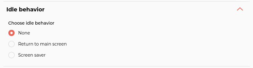
The M-DOT-T6 module allows you to define its behavior after a specified period of inactivity, enabling you to tailor its operation to user preferences.
The inactivity time can be set between 5–300 seconds (default 20 seconds).
After the defined inactivity time elapses, the device can:
 Click to enlarge and open in a new tab.
The “Return to the home screen” option allows you to set the time after which – in the absence of interaction – the panel automatically switches to the first screen.
This feature is particularly useful when the user wants the panel to always display the start screen with the most important widgets after a longer break.
 Click to enlarge and open in a new tab.
The screensaver is a minimalist view presenting key information such as time or temperature.
It does not contain interactive elements – to return to the standard interface, simply touch the screen.
 Click to enlarge and open in a new tab.
For the screensaver, you can also set the inactivity time after which it will be activated.
The screensaver displays the date and time, which must be linked to the appropriate leafs from the server.
If the leafs are not assigned, these values will display “0”.
You can choose between 12h or 24h time formats.
 Click to enlarge and open in a new tab.
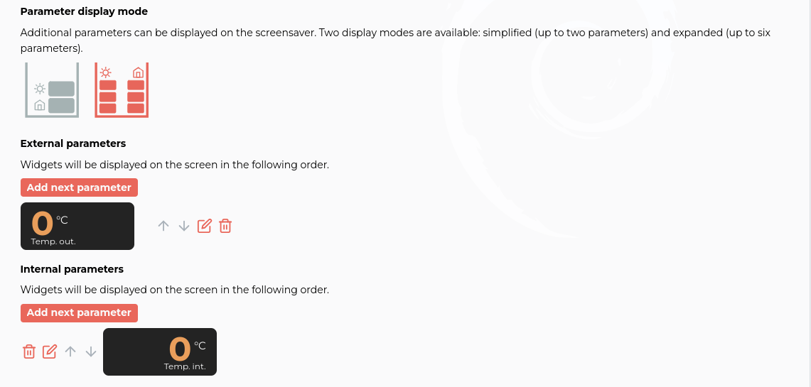
The screensaver can also display additional parameters similar to display widgets, such as temperature, air quality, or energy consumption.
Parameters are divided into:
This allows the user to easily distinguish the data source without using long descriptions.
Two display modes are available:

When configuring parameters, first select one of the two display modes.
Then add the desired parameters (external or internal).
Parameter configuration is similar to display widget configuration. Click the ‘paper and pencil’ icon next to the parameter you want to edit.
In the configuration window, you can adjust:
 Click to enlarge and open in a new tab.
Once the configuration has been created, it needs to be uploaded to the M-DOT-T6. Uploading the configuration is done using the button with the floppy disk icon in the top centre of the configurator.
If the colours were changed, when the save button is pressed, an additional window will appear informing you to upload the new icons to the module. This process can take up to 10-15 minutes. At this stage, the colour change can also be abandoned, restoring the colours previously uploaded on the M-DOT-T6.
The configuration menu allows you to save and upload the created configuration. It is located at the very top of the Display Creator. It is recommended that after completing the configuration, you use the save button and keep the finished panel on disk.
The configuration menu allows you to:

Most often this problem is caused by an interrupted icon upload.
To upload them again you need to open Developer Tools at the bottom of Display Creator. Then press Save User Icons and Save Theme Icons, which will re-upload the icons.
In extreme cases, where all other solutions fail, a reset of the M-DOT-T6 configuration may be required.
M-DOT-T6 emergency reset:
In the Ampio Designer, go to Devices -> CAN -> Frames -> RAW.
Select M-DOT-T6 as the device.
Enter “29E0FC00000000” as the message to be sent.
After pressing Send, the configuration of the M-DOT-T6 will be completely reset.
This operation is irreversible!
In such cases, you need to check the module in the device list and then press the update button at the top of the device list.
Values automatically adjusted to the leaf with the possibility of modification. ↩︎