Panel Creator is an application that allows you to create personalised Ampio glass touch panels used for smart home control.
The Panel Creator allows you to manage multiple projects simultaneously. You can open a completely new project, or work on a project previously saved to a PDF file.
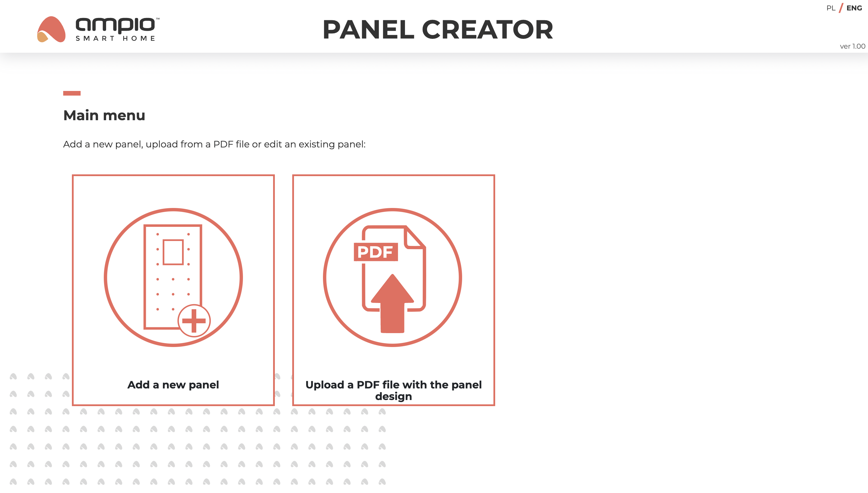
Each project can be edited, deleted, duplicated or saved as a PDF file from the main menu. The use of functions that cause irreversible changes is protected by relevant alerts.

The panel editor consists of an editor section and a preview section. At the top of the editor section is a menu with tabs corresponding to the main panel configuration options, which are later displayed in the preview section. In the panel editor view, there is a top bar for editing the panel name, a bottom bar with the name of the selected model, colour and scale control panel with the option for a full screen view, and a side bar with additional options for managing the project. The visibility of some of the options on the side bar depends on the selected editing tab.

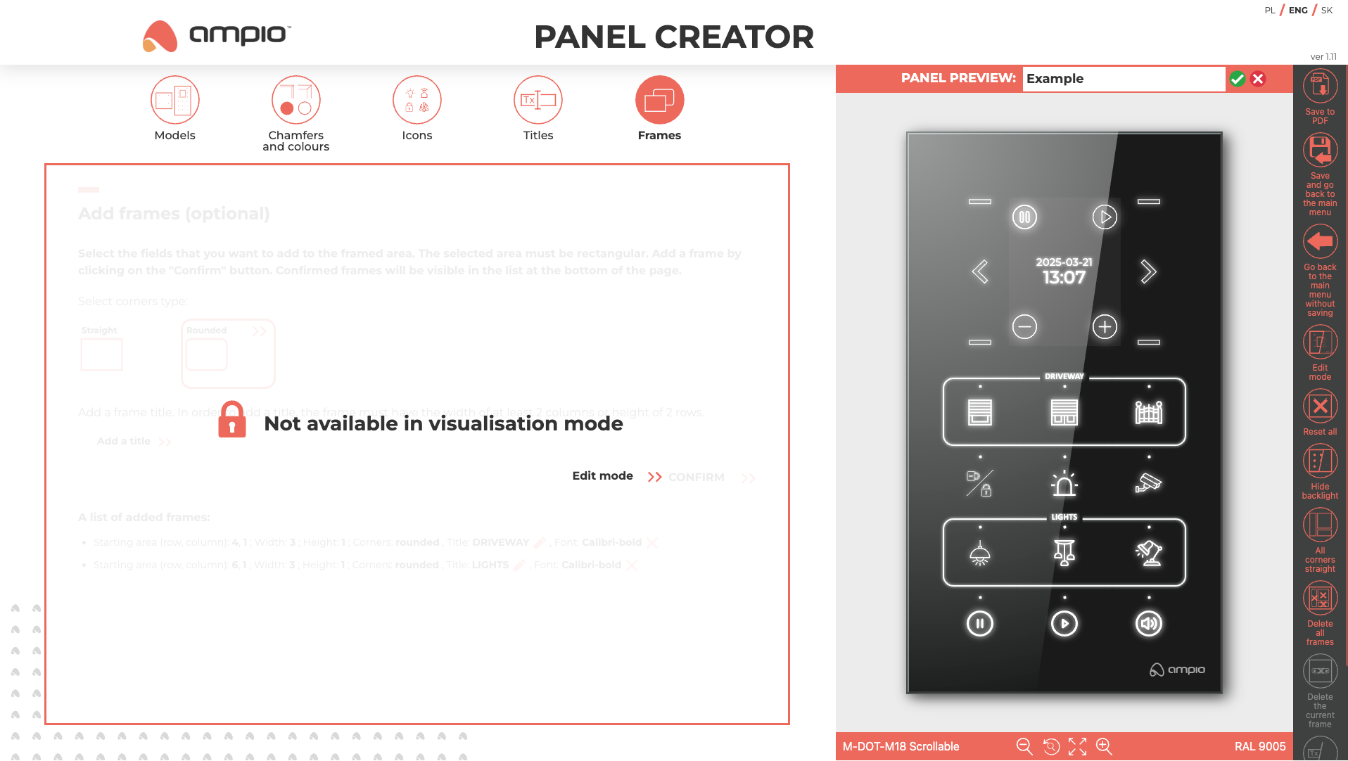
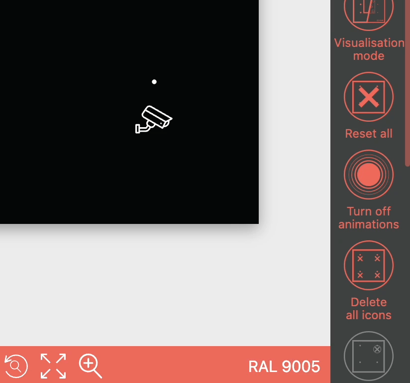
The option to activate the visualisation mode in the side menu is available throughout the editor. The visualisation view allows you to replace the schematic view of the designed panel in the preview section with the target view of the device. The editing of icons, subtitles and frames is only possible in edit mode, which is indicated by the following message.
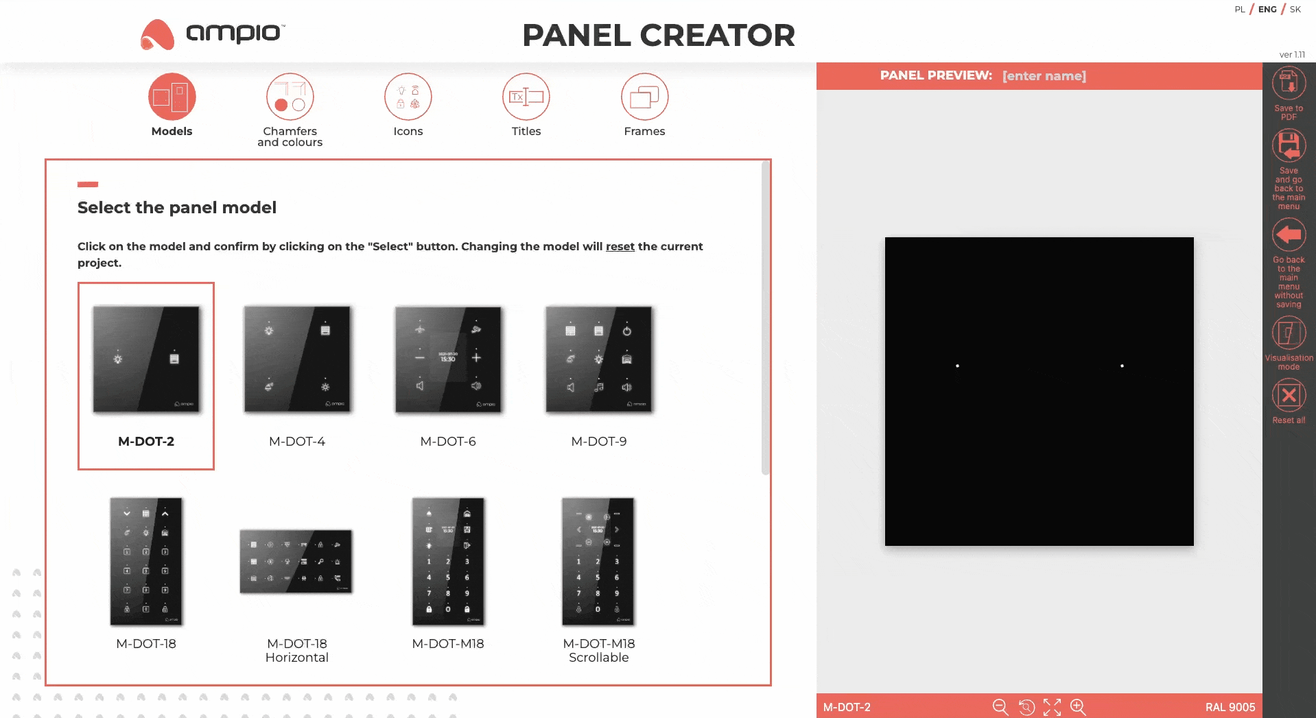
In the Models tab, all personalised panels from the Ampio range are available. Each model has a short description and a link to the Ampio Knowledge Base where you can find detailed information about the model in question.
In the Chamfers and colours tab, it is possible to select the panel edge style, as well as the glass colour from a palette of basic and custom colours. The difference in appearance of the panel with the different edge styles is shown in visualisation mode, as indicated by the tooltip appearing next to the individual chamfer options. For selected models, it is possible to select smoked glass, but this selection makes it impossible to add borders - details are described in the tooltips appearing next to the respective colours.
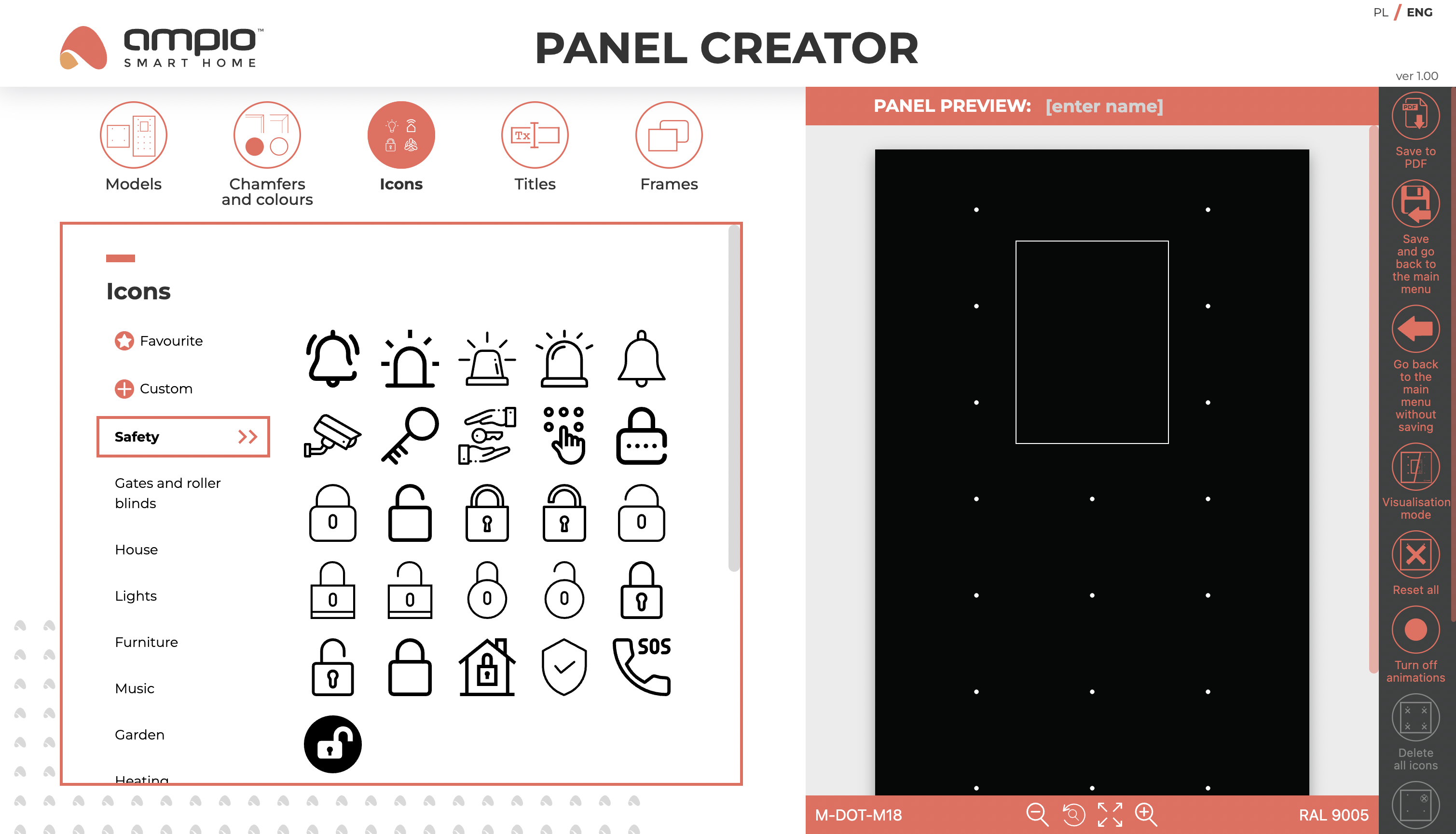
The Icons tab contains categorised icons provided by Ampio with the option to mark them as Favourites, Custom icons uploaded by the user and a section for managing Status LEDs and the Keyboard.
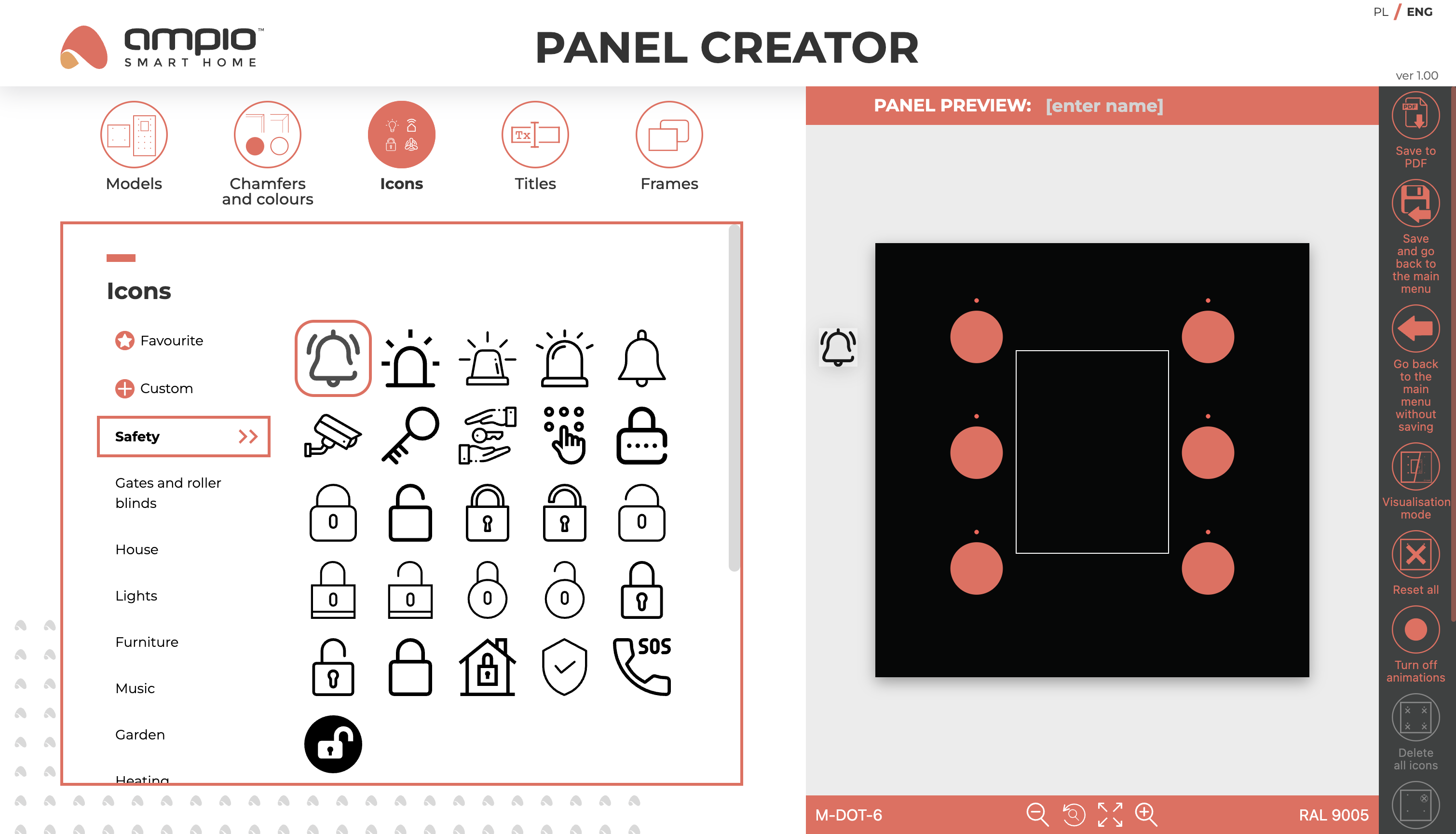
Icons can be placed on the panel by dragging and placing them on one of the available fields, which highlight when an icon is placed over them. Each of these fields has space for a full-size icon and a light point above the icon. If an icon is placed in a field occupied by another icon, it will be replaced. The deletion of a previous icon is indicated by displaying an X on the icon before dropping a new icon.
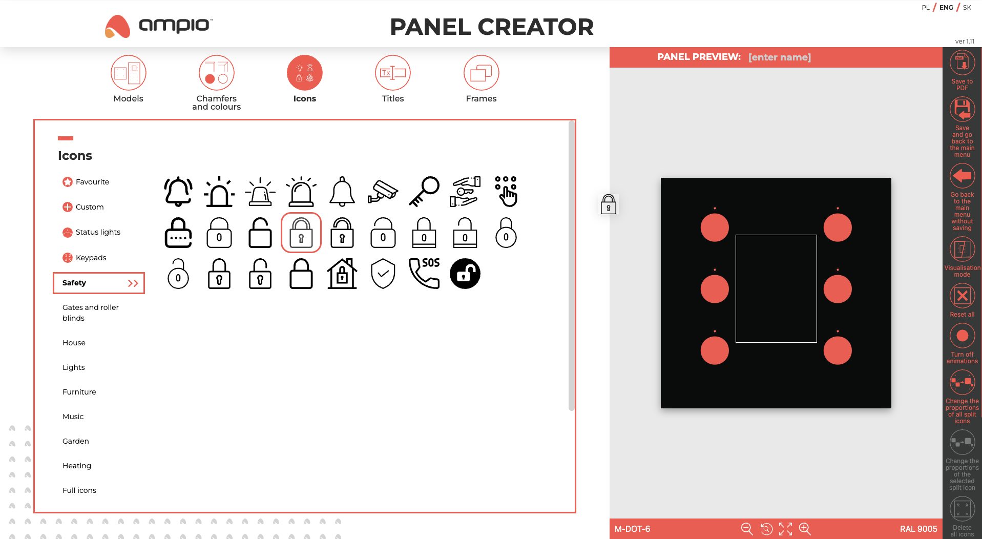
In addition to highlighting, the fields also have animations, which can be switched off in the side menu.
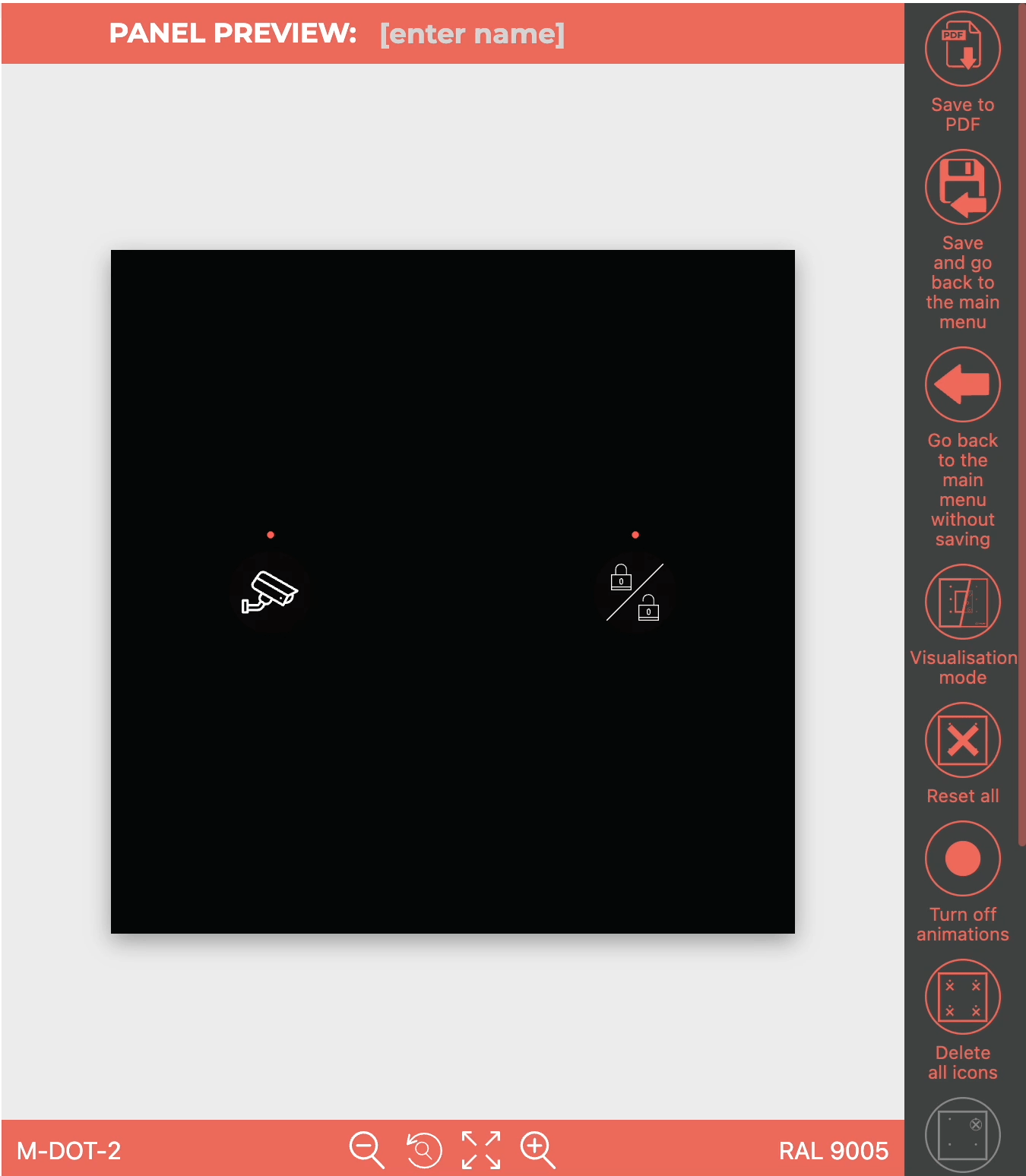
An icon can be placed in one of four places in each field:
When the cursor hovers over the corresponding icon spot, the highlight will turn green. Split boxes for the two icons will highlight when the cursor is close enough.
Due to potential highlighting issues with the status icon, a warning window appears. The warning windows can be hidden, but the show/hide warning button will remain at the bottom of the side menu.

When the icons tab is selected, the side menu will show additional functionalities: for all icons and for the selected icon only (option greyed out until a specific icon is selected).
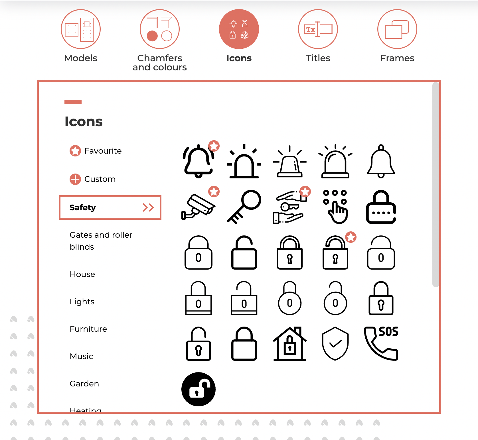
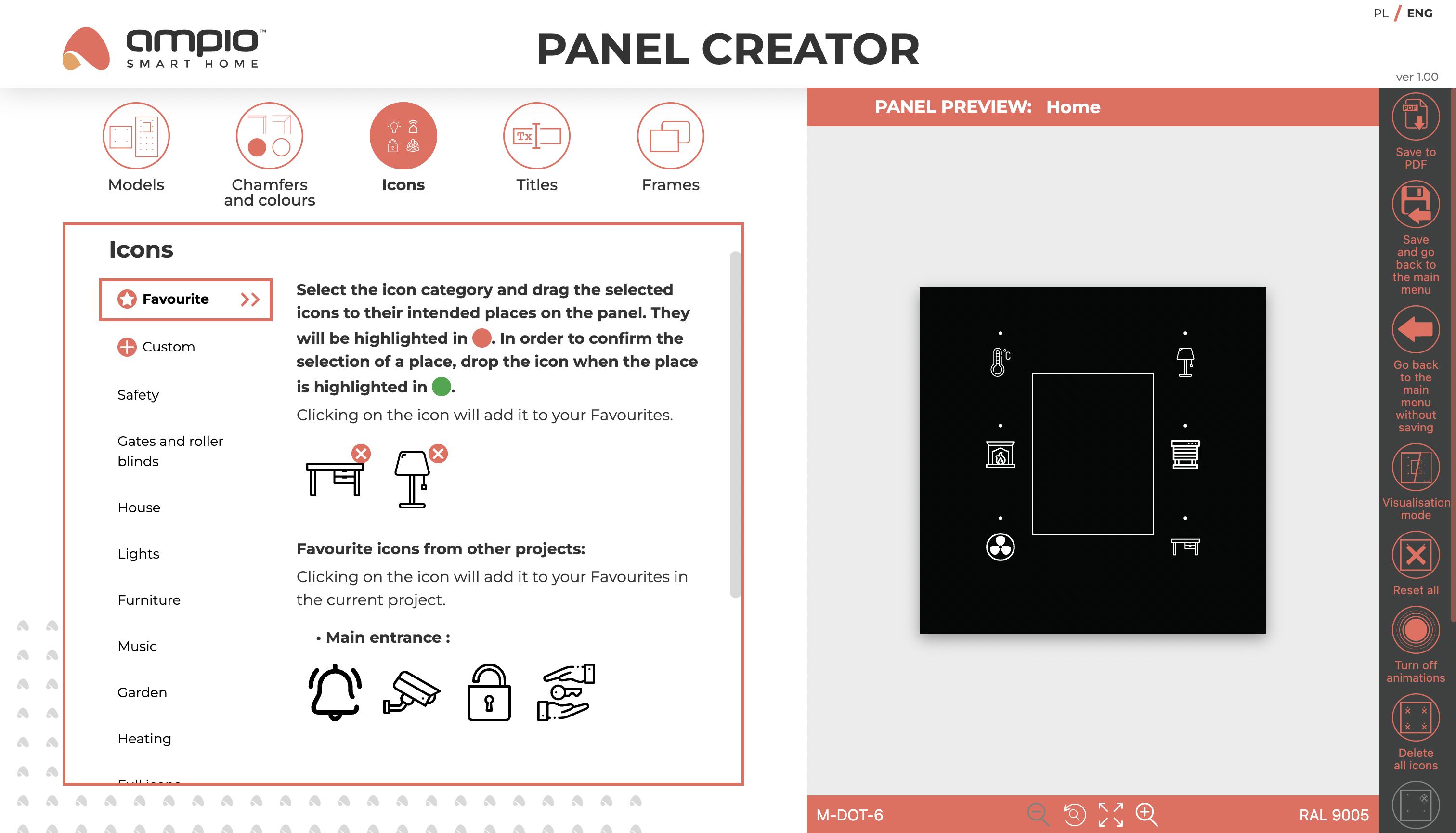
To make working with the editor easier, it is possible to add selected icons to Favourites by clicking on them. Favourite icons are marked with an asterisk and grouped in the Favourites section at the top of the list of icon categories.


The Favourites section also contains icons marked as favourites in other projects added to the Panel Creator.

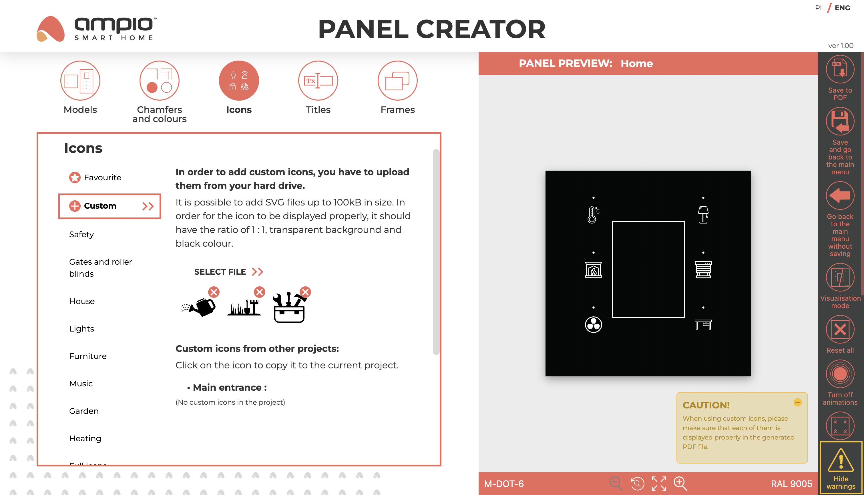
The Custom section allows you to personalise your project with your own icons by uploading them to the creator from your computer’s hard drive. It is possible to add files with SVG extension up to 100kB in size. For the icon to display correctly, it should have an aspect ratio of 1 : 1, a transparent background and a black colour. As with Favourite Icons, it is also possible to use Custom Icons from other projects added to the Panel Creator. Any icon added by the user is converted by external software to match its parameters to those required for the Panel Creator, but when using a Custom Icon, it is important to check each time that it displays correctly on the generated PDF file. A warning indicating this necessity is displayed when a Custom Icon is added.

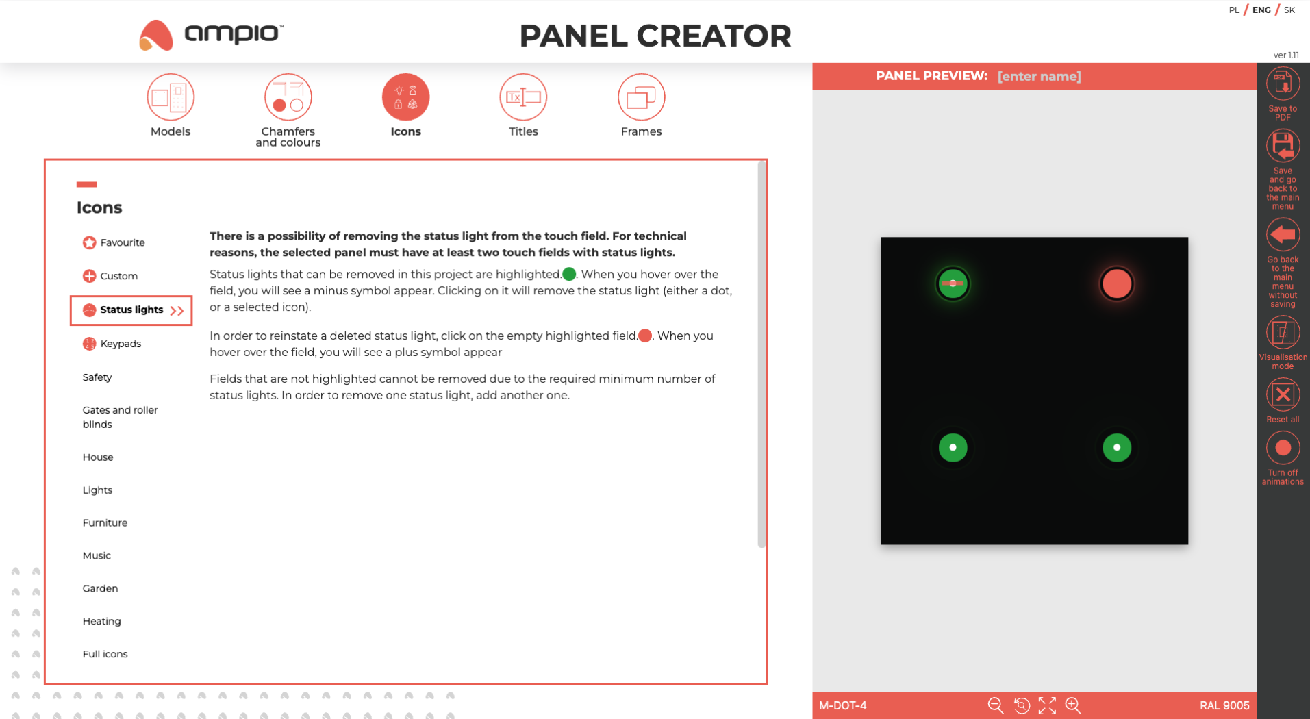
The Status LEDs section allows them to be removed from the sensor field. For technical reasons, the selected panel must have at least two sensor fields with a status diode.
Deletable status LEDs present in the project are highlighted in green. When the cursor hovers over such a field, a minus symbol appears on it. By clicking on such a field, the status LED (dot or selected icon) will be deleted.
To restore a deleted status LED, click on an empty field highlighted in orange. When you move the cursor over such a field, a plus symbol will appear on it.
Fields without highlighting are impossible to delete due to the minimum number of status LEDs. To remove such a diode, add another one.
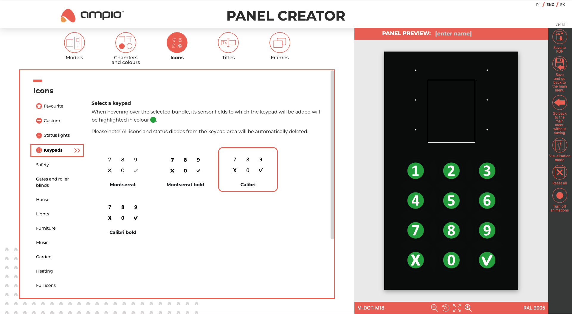
The Keyboard section for selected panel models allows a set of icons to be added to form a keyboard. Several sets with different font typefaces are available. When the cursor hovers over the selected set, the sensor fields where the keyboard will be added, will illuminate when clicked. When adding a keyboard, all icons and status LEDs from the area of the keyboard to be added will be automatically removed, as indicated by a warning in the displayed window.
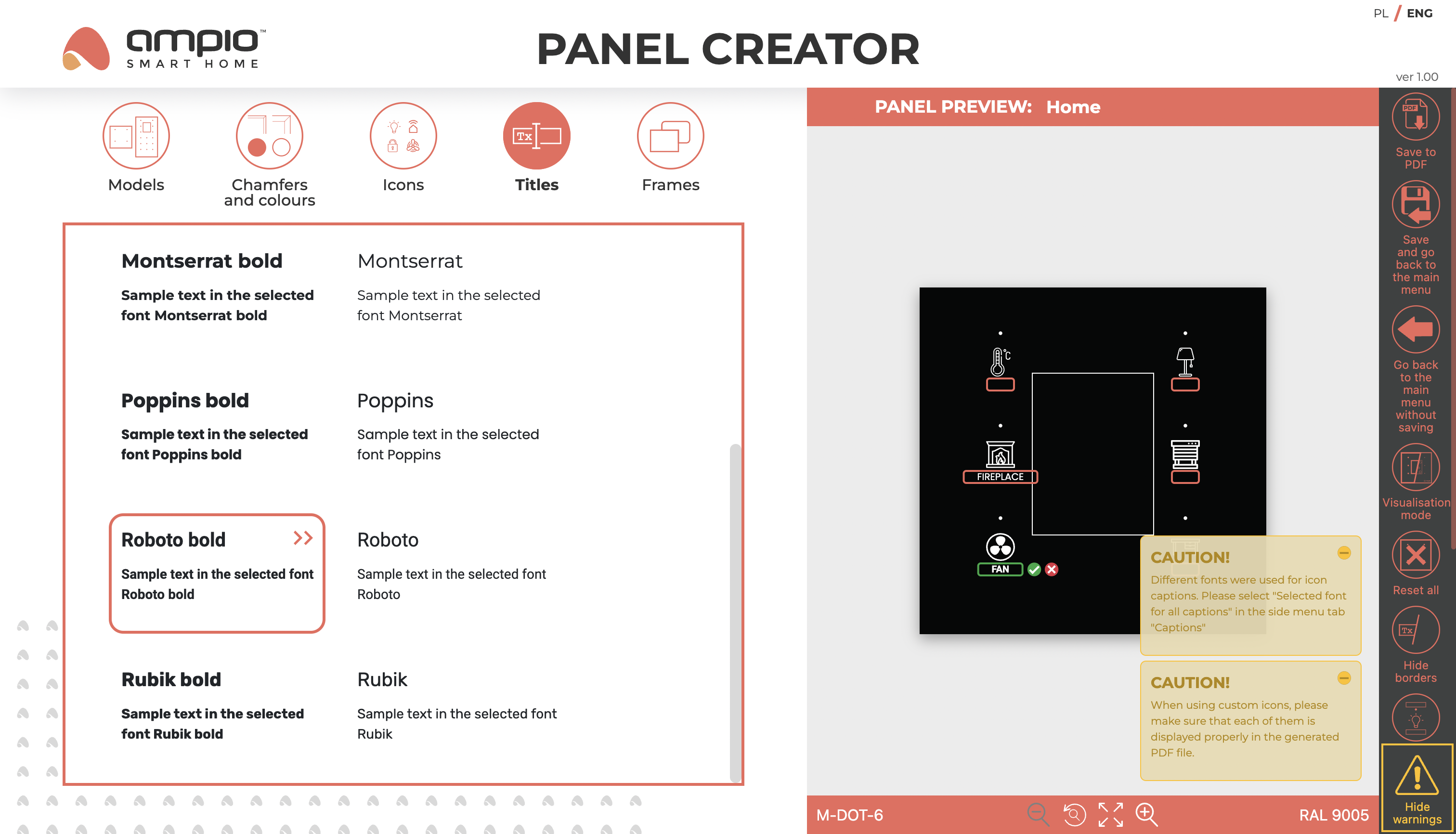
It is possible to add two captions next to each touch panel field - one above and one below the icon. To add a caption, click the cursor in the corresponding text box in the preview section and then start typing. The font selected at the time of writing in the edit section will be assigned to the text box. Fonts of different typefaces and styles are available.
Captions can be up to 16 characters long, but if they are longer than 9 characters, a warning will appear. The editor will also display a warning if different fonts are used in the same project in order to maintain consistency in the appearance of the panel.
When the Captions tab is selected, the side menu contains additional functionality for hiding borders, enabling/disabling captions over icons (disabled by default), deleting all captions at once and selecting one font for all captions.

For selected models, the Captions tab also allows the configuration of an RFID reader. By default, the reader has a full frame and an RFID logo in its centre, but it is possible to add your own logo or text there.
To add your own logo, you need to upload it from your computer’s hard drive. It is possible to add files with SVG extension up to 100kB. For the logo to be displayed correctly it should have an aspect ratio of 2 : 1, a transparent background and black colour. Any text within the graphic must be converted to curves.
The uploaded file will automatically take up the entire logo area, which is 40 mm x 20 mm. If you would like a smaller graphic size, please take this into account when creating the SVG file.
Adding your own text to the RFID reader is done in the same way as adding text under or above icons. Next to the text field, there are buttons for resizing the text, confirming it or deleting it. The maximum text length is 20 characters.
If you use your own logo or text, the RFID logo is displayed at the top of the reader frame.

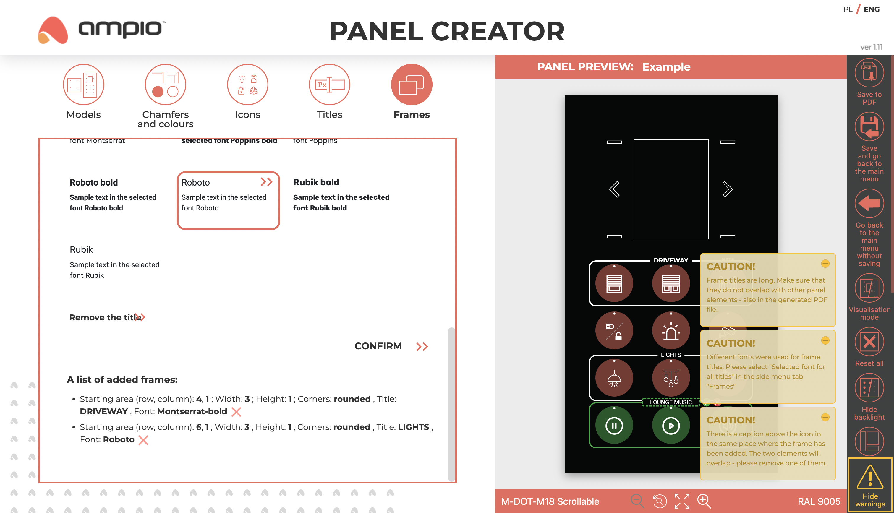
Creating frames is an option that can be used to group icons added to the panel. Frames with straight and rounded corners are available. When the Frames tab is selected, the touch fields are highlighted, with a plus sign appearing when the cursor is hovered over them to add a field to a frame. The plus also appears on all other fields that will be included in the frame when clicked (the frame must always be rectangular and must not go across the screen). Removing fields from the frame area works similarly - the minus sign will indicate those fields that will be excluded from the frame.
The created frame is green. If a frame is created surrounding only one icon, it will automatically shrink that icon. If the frame is larger (at least 2 icons high, or at least 2 icons wide), it will surround the entire field occupied by these icons and you will be able to add a caption to the frame by clicking on ‘Add title’. The title should be entered in the text box in the preview section and then confirmed with the green button. Different typefaces and styles are available - similar to the Captions tab, the text entered will be in the font currently selected in the edit section. and the maximum length of the caption next to the frame is 16 characters. The completed frame must be approved by clicking on the ‘APPROVE’ button at the bottom of the editor - the frame will then appear on the panel in the icon colour. All parameters of approved frames will be listed at the end of the frame editor section. Hovering the cursor over any of the list items will highlight the frame in question in red. It is possible to edit a potential frame title by clicking on the pencil button next to the title, and it is also possible to delete a frame by clicking on the X.
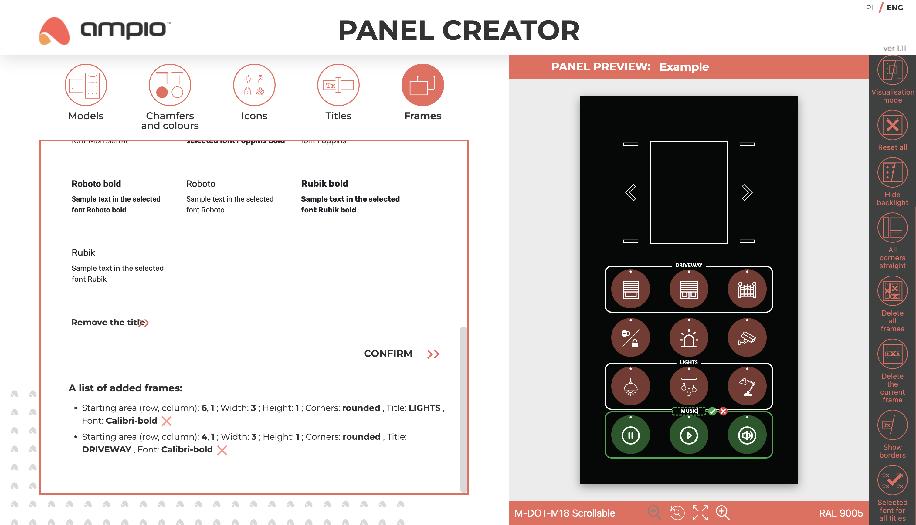
The following warnings may be displayed when creating frames: frame title too long, different fonts for frame titles, frame crossing the caption over an icon. When the Frames tab is selected, the side menu contains additional functionalities such as: unify corner types, unify frame title fonts, show/hide field highlighting, show/hide borders, delete frame being created and delete all frames. Where certain functionalities are greyed out, tooltips will be visible to explain why the function is not available.